It’s not very often that an opportunity comes along to create something unique and personal in printmaking. Relief prints, by their nature, can be printed repeatedly from a single block, and are therefore usually made in editions of (nearly) identical prints, to be sold separately. So it was an exciting opportunity for me to receive a commission to design, cut and print a master copy of a traditional Ex Libris, or bookplate, to be presented as a retirement gift to a local businessman.
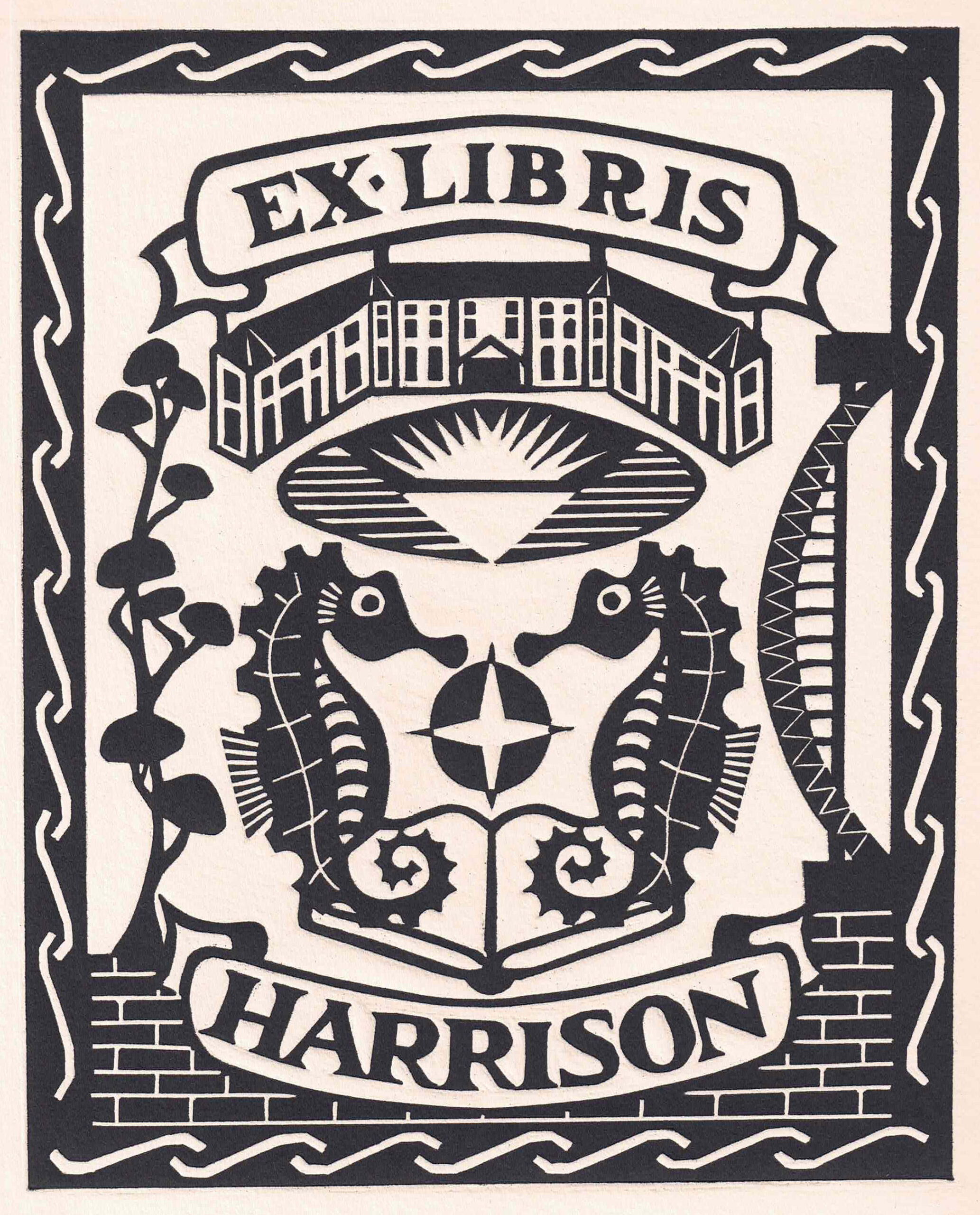
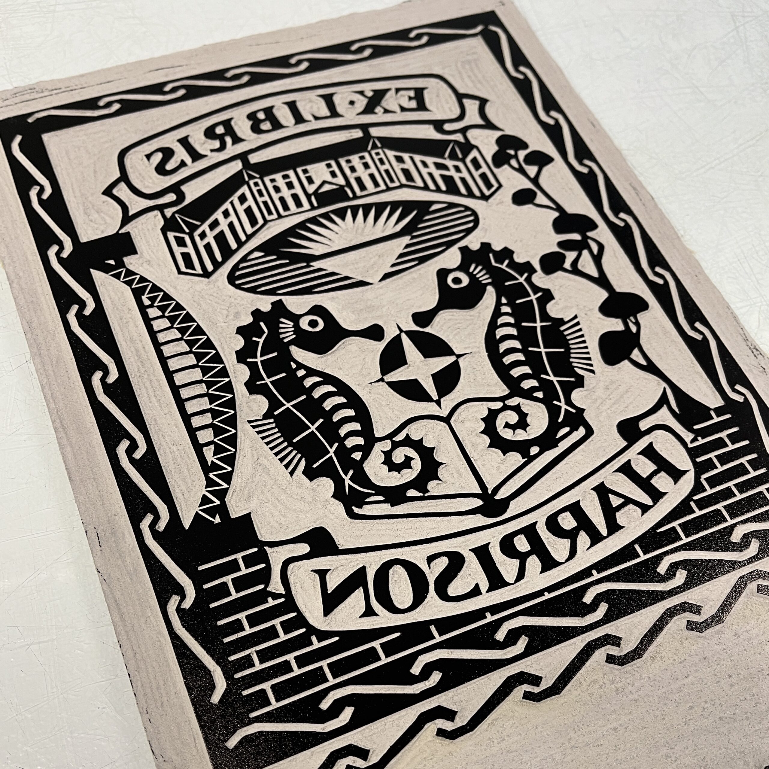
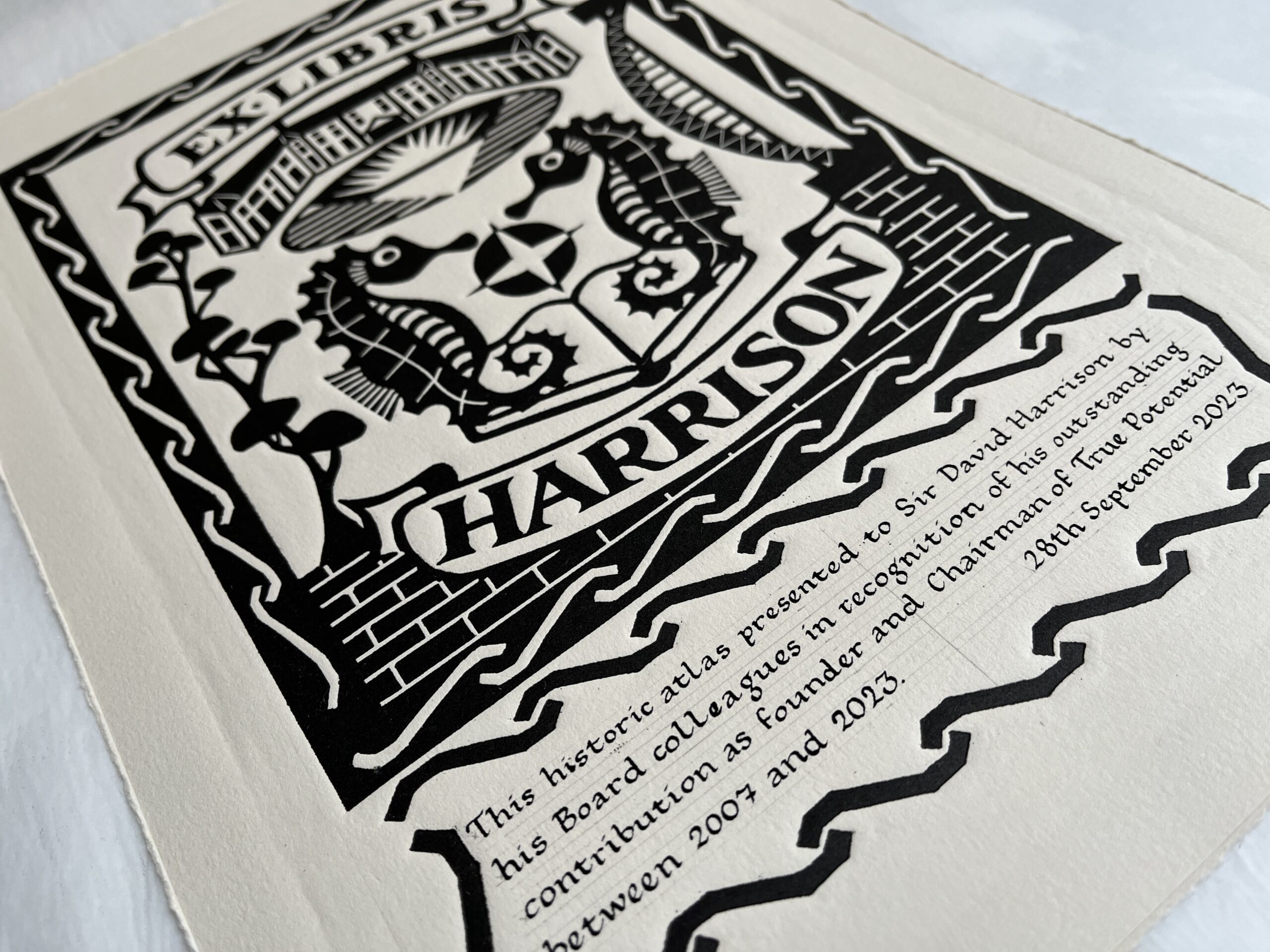
Ex Libris plates were traditionally pasted into books to indicate their owner or to affiliate them to a particular collection, and there is a strong tradition of relief printmaking in this artform, largely in woodblock but also in linocut. The bookplate designs would often incorporate a heraldic element such as a coat of arms or family crest, but in my case I was starting from scratch with a blank block of lino and a few details of my client’s work history and background. I was keen to retain a traditional feel to the design, keeping a symmetrical composition, but at the same time incorporating motifs personal to the client but which were otherwise uncommon in bookplate design, such as the agave plant, the Roman mosaic knotwork border pattern and the brick wall. I was so pleased to be able to include the Tyne Bridge and the seahorses, emblem of the city of Newcastle upon Tyne. I hope that I managed to create a design which tells a very personal story to the owner, and yet is still pleasing to the eye for any other observer.
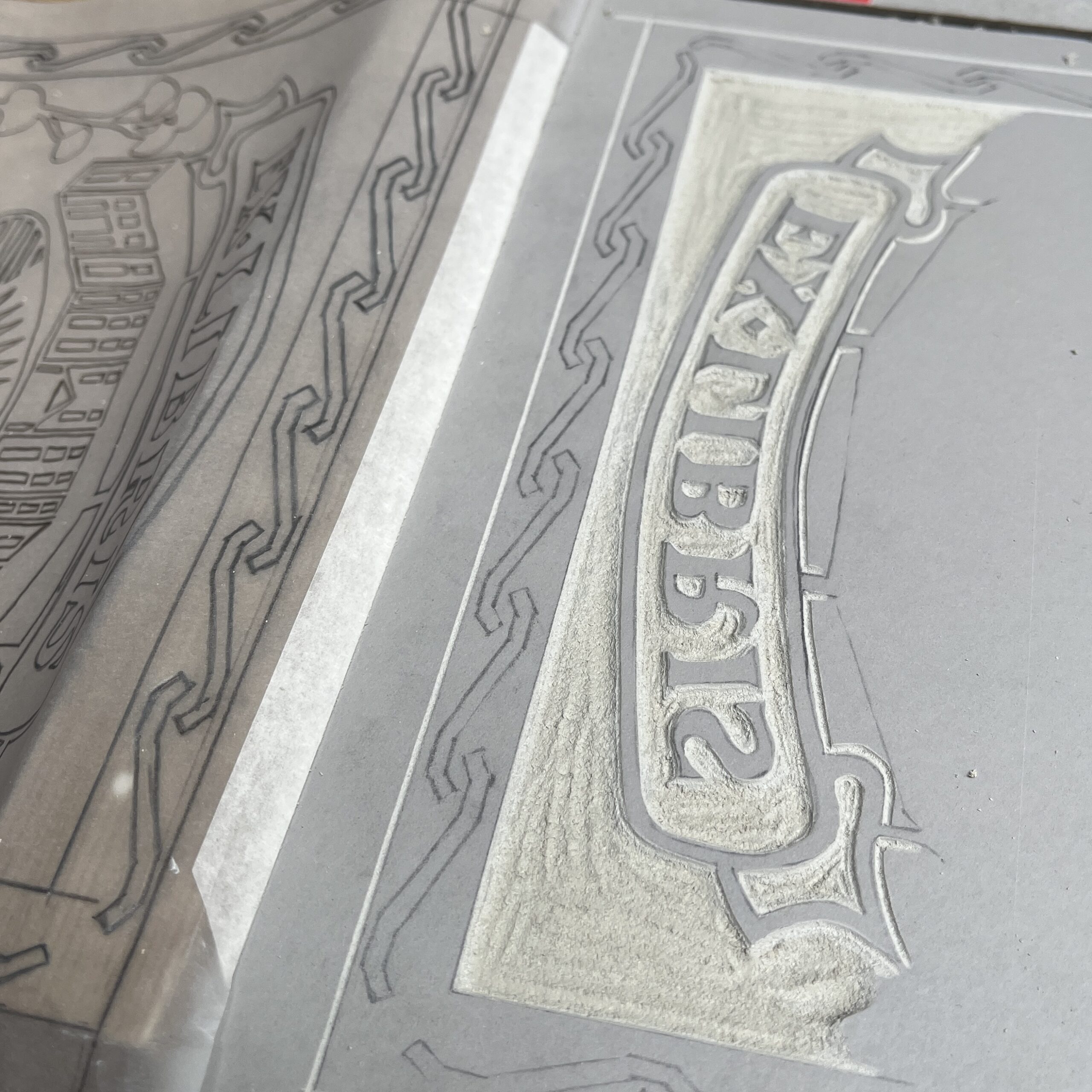
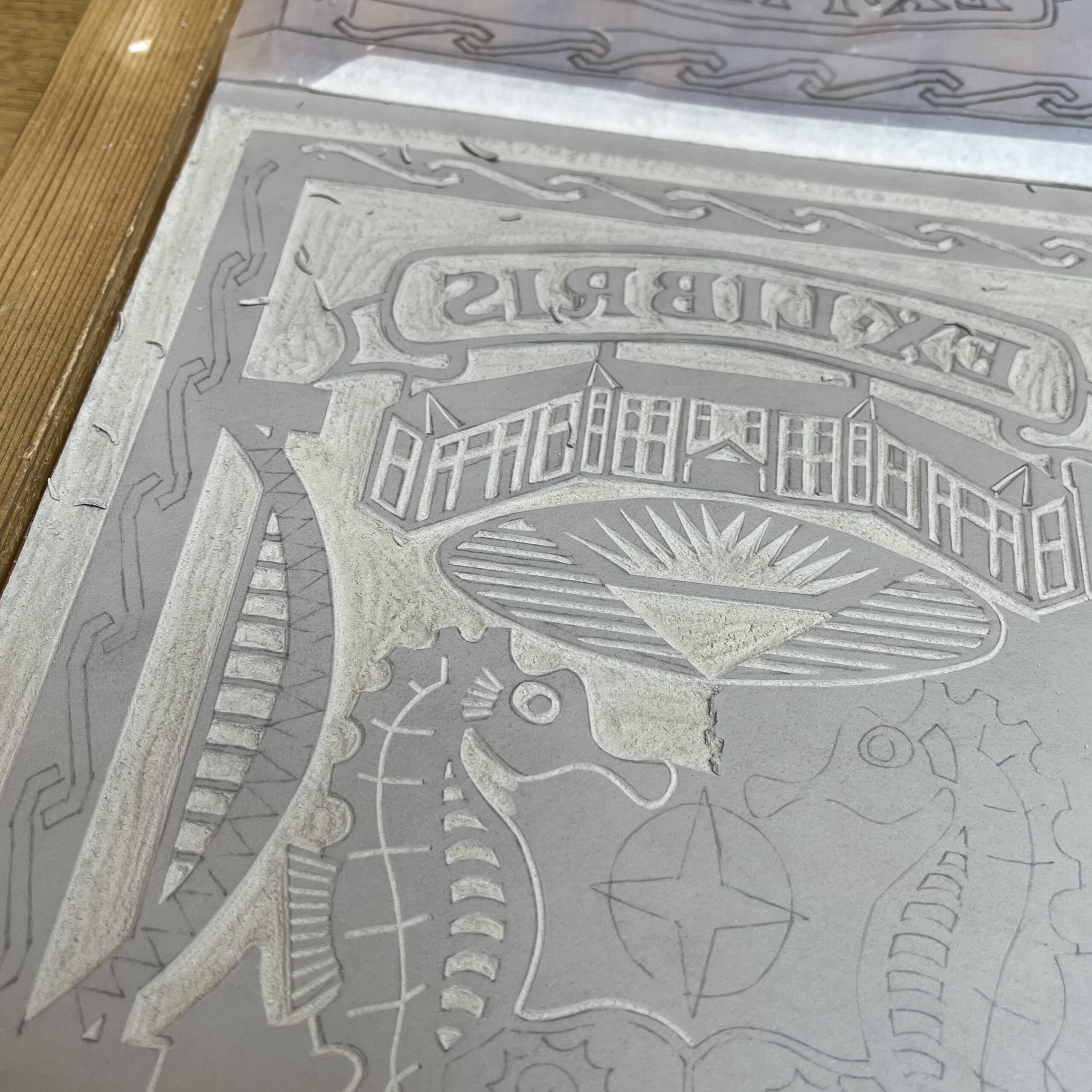
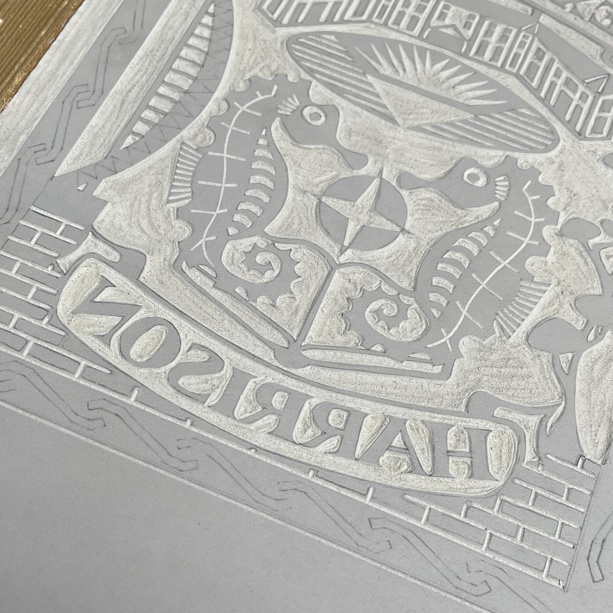
Having agreed on a design, I took my time with the cutting of the block. Although this was an exceedingly time-sensitive commission, the cutting could not be rushed. I was working to A4 size and the design was intricate. One slip would have been enough to warrant starting again, so I worked slowly and methodically across the block, cutting the design in reverse, so that the final print would be the right way round.
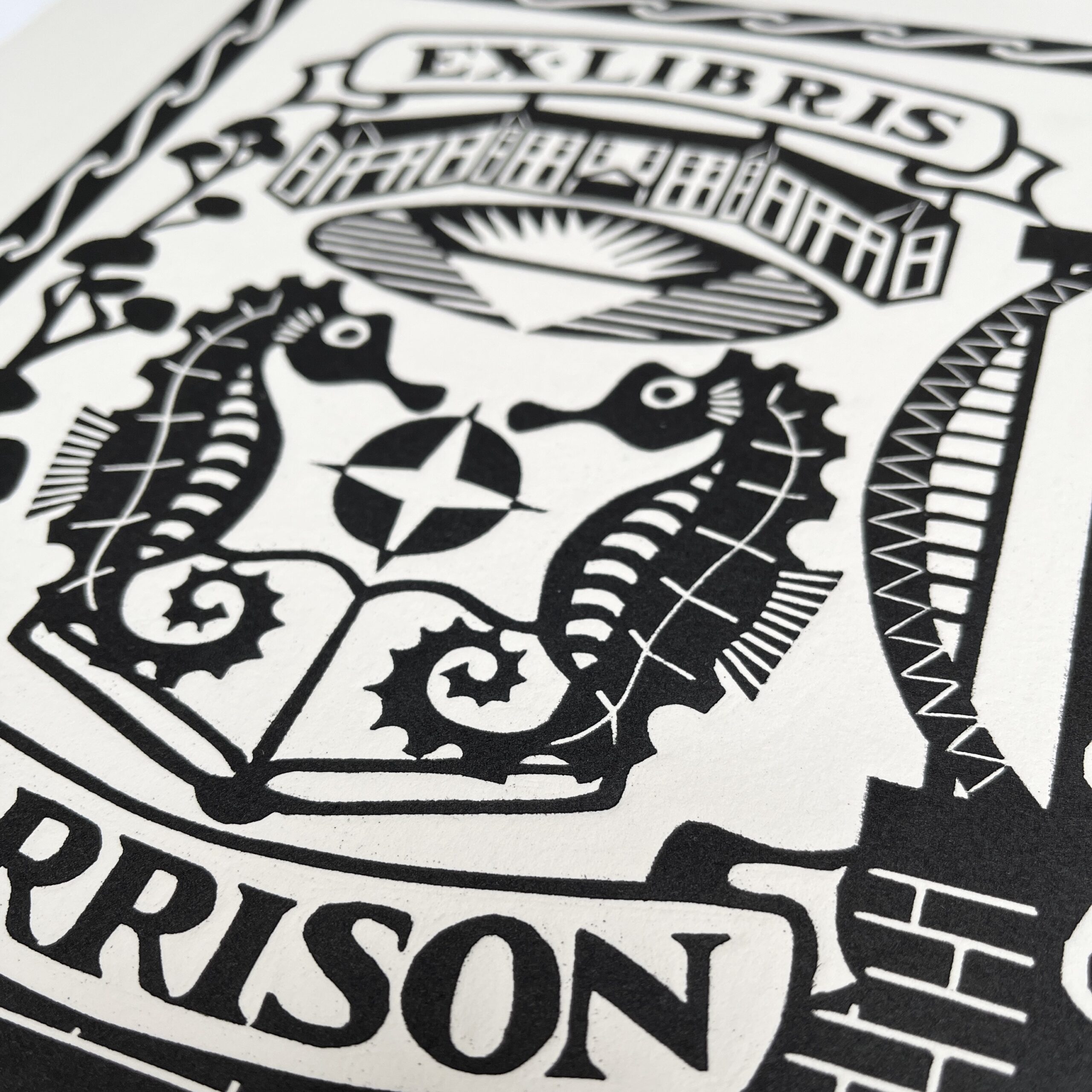
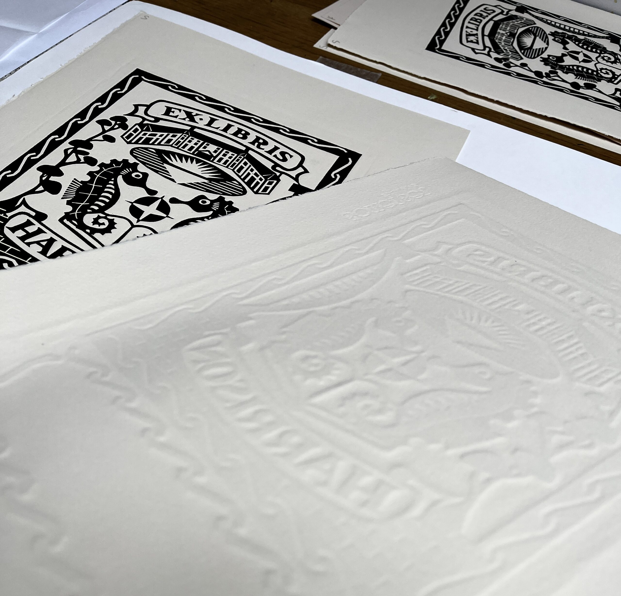
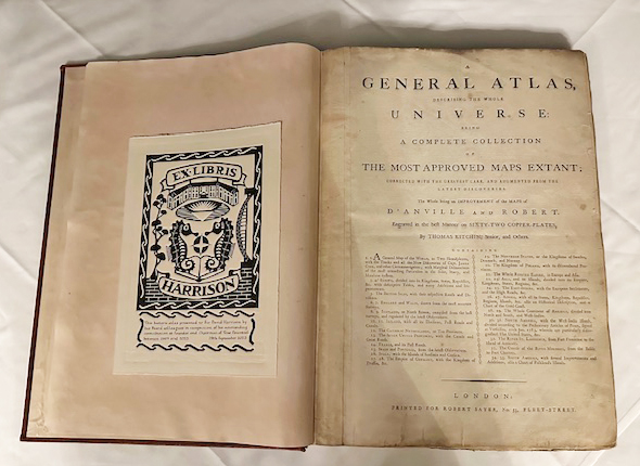
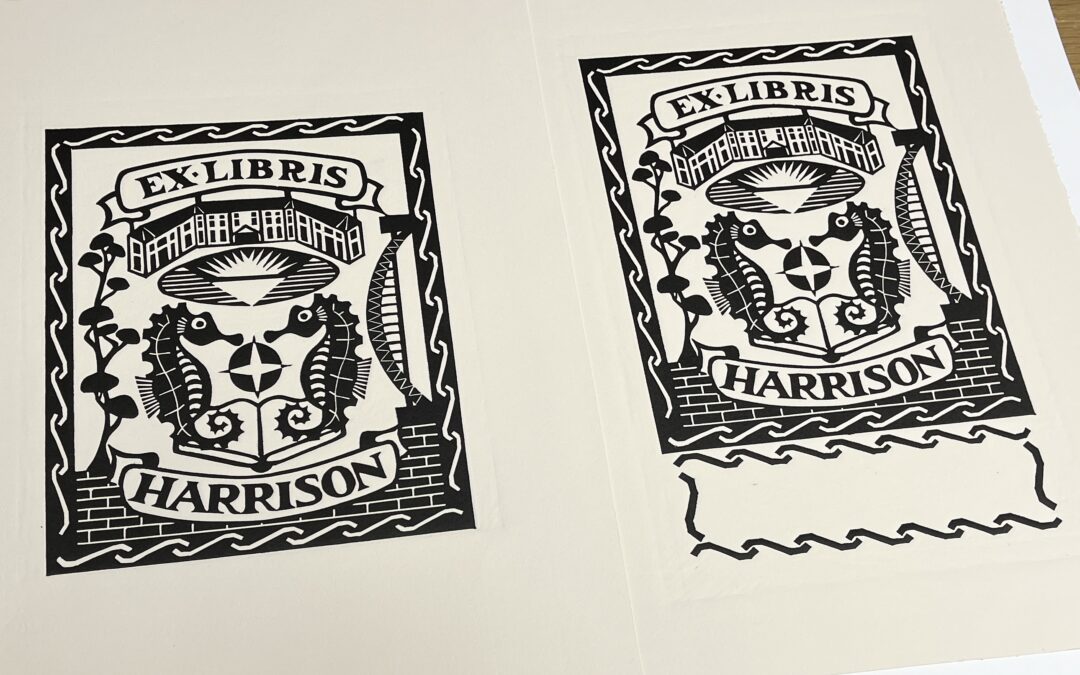
The original bookplate was to be pasted into an antique atlas printed in 1788, so it was important to me that I chose some sturdy, good quality paper which wouldn’t look out of place. I made test prints on a few different papers, and in the end opted for a heavy Somerset paper in a warm cream colour. While I usually prefer to print by hand, for this commission I wanted to achieve an emboss, so I dampened the paper to open up the fibres and printed the block in a press, which applies a much greater and very even pressure across the surface. The embossed effect adds to the texture of the print, and the oil based ink is silky smooth against the surface of the paper.
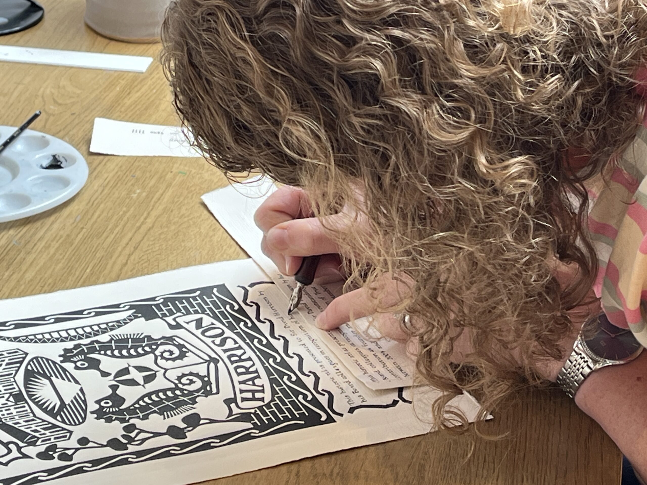
After a nervy week watching the ink dry, it was time to add the finishing touches. I kept a rough edge around the paper, by tearing rather than cutting, and called upon Angela of Creative Calligraphy to write out the dedication in her steady hand. It was fascinating watching her work and it wasn’t easy to fit the wording into such a small space, but with much measuring, remeasuring, calculating and counting (there’s a lot of maths involved in calligraphy!), she beautifully scripted the dedication using black gouache. I should say a big thank you to her for coming to my rescue at a moment’s notice and calmly fitting the final piece of the jigsaw into place.
And so, as with all commissions, my original prints went off into the world, and will be reprinted digitally throughout the owner’s collections of books. As a book lover myself, it was an absolute pleasure to be involved in a project like this and I love to think that a reader in a hundred years’ time might open the atlas and run their finger over the embossed surface of the bookplate, wondering about the hand that cut the seahorses or the hand that wrote the dedication. It also makes me feel proud to be a little part of continuing that printmaking tradition which was so alive a few centuries ago.